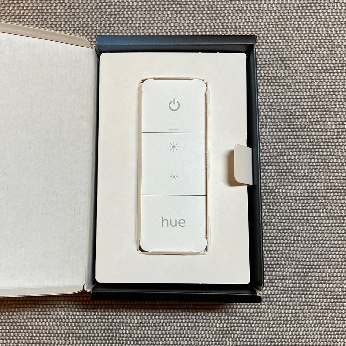
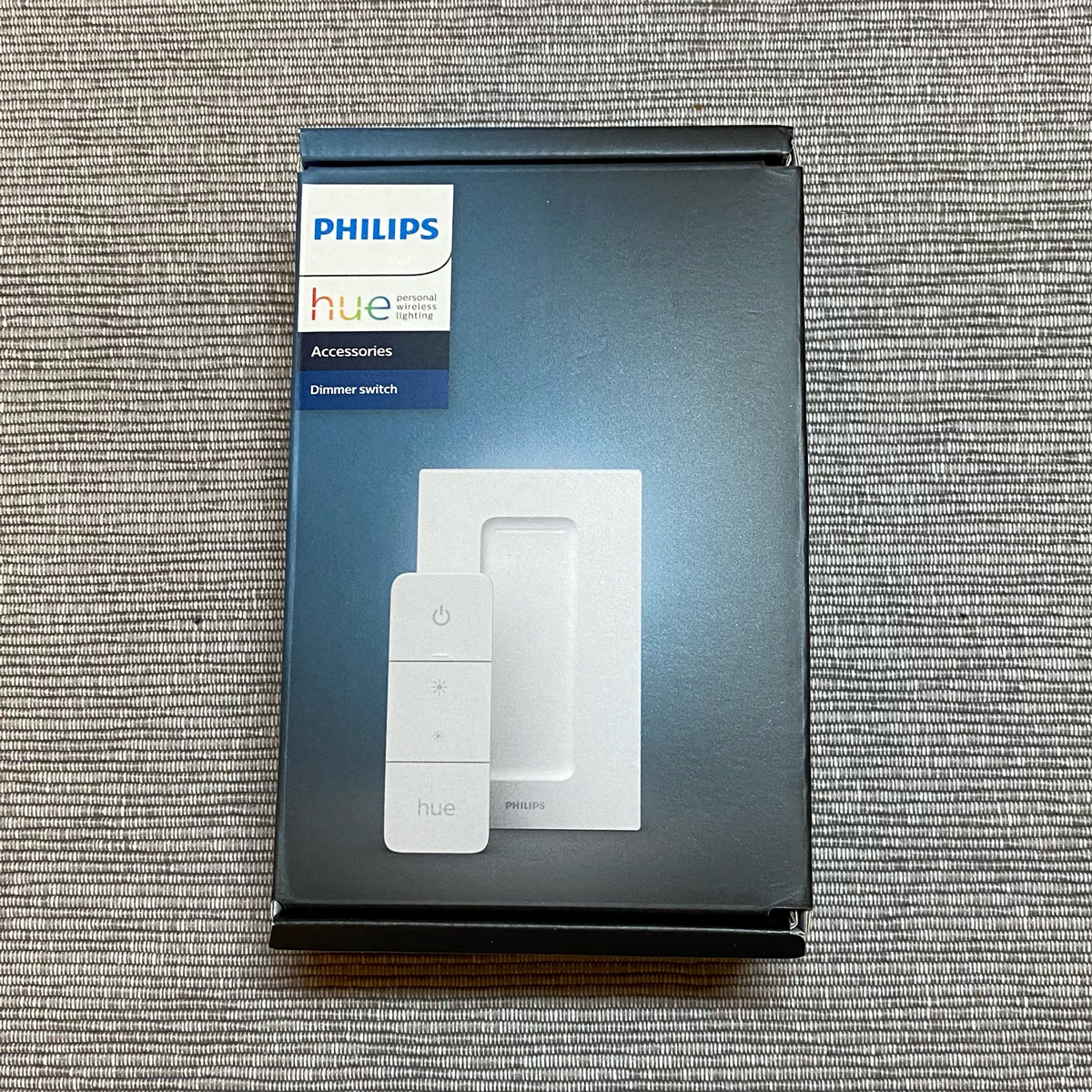
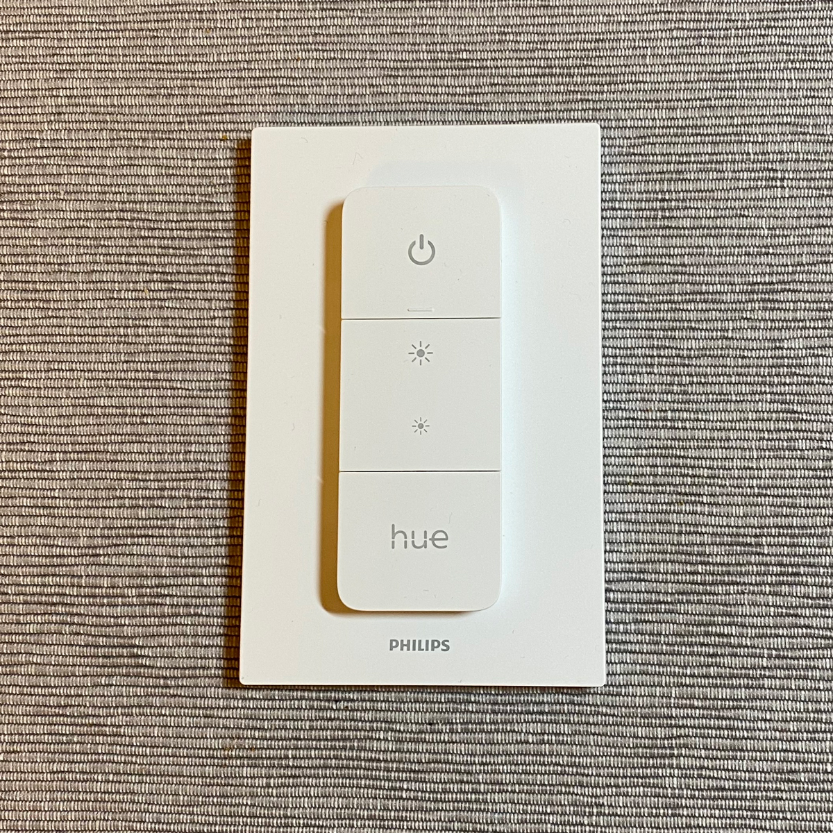
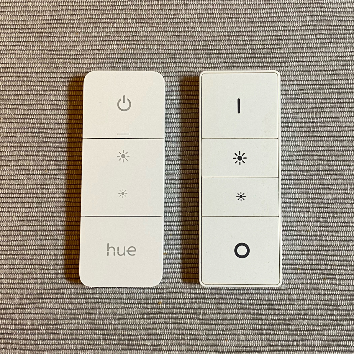
The new dimmer switch is now available in parts of the EU, with the US release to follow, and whilst the improvements are mostly cosmetic, the overall impression left with us is one of satisfaction. When you compare it to the original dimmer switch, you’re reminded that this classic design was nonetheless in dire need of improvement, albeit seemingly slight.
So here we simply present a series of photos, along with tidbits of information, so you can decide for yourself if you can resist buying this shiny gem of white plastic…
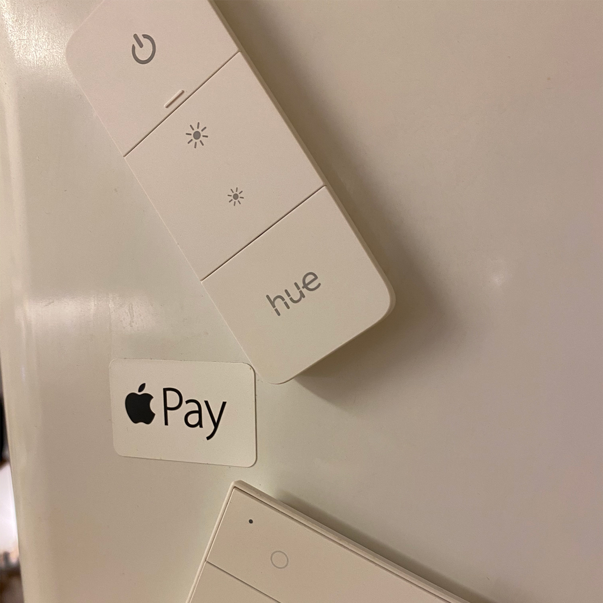
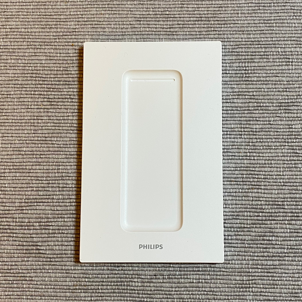
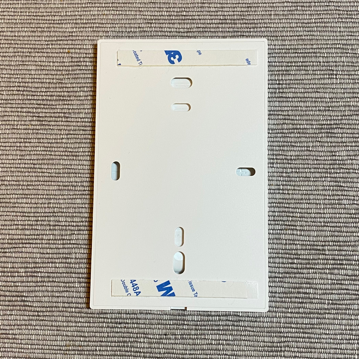
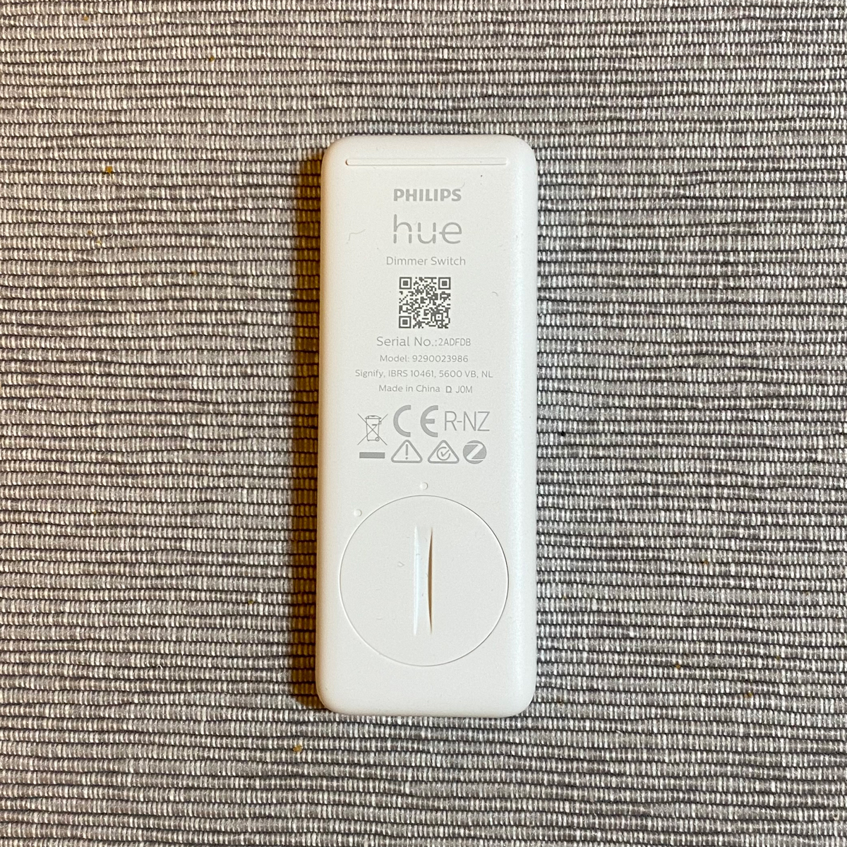
The new dimmer uses matte plastic, which is nice to the touch. The new middle button, although essentially a sort of mini rocker switch, still feels like two separate buttons, in practice. The previous model had its magnets in the faceplate. Philips have now moved the magnets into the switch itself, so you can attach the switch directly to a magnetic surface without the need for the faceplate. The faceplate itself has also had a small improvement, in that it’s now wide enough to cover a standard EU wall switch recess.
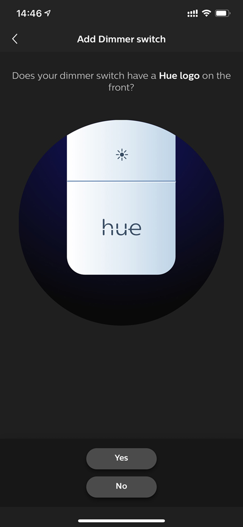
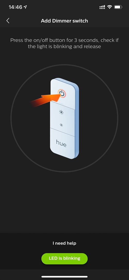
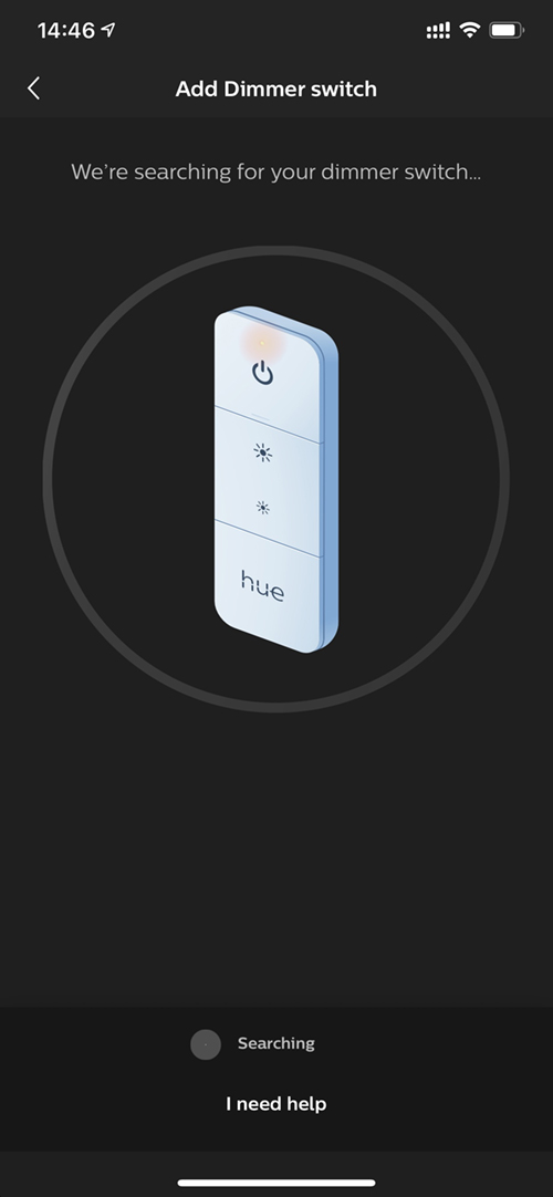
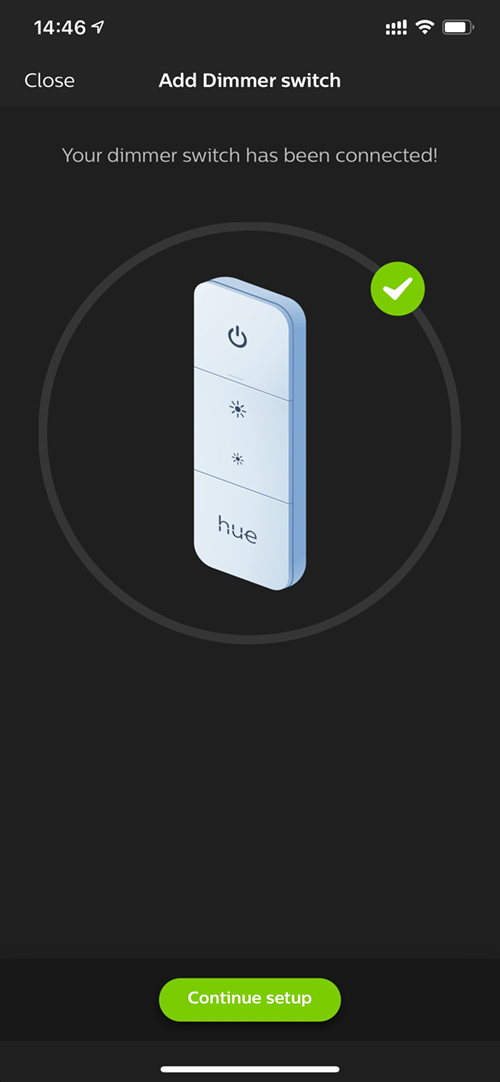
INSTALLATION SCREENS
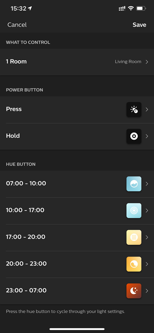


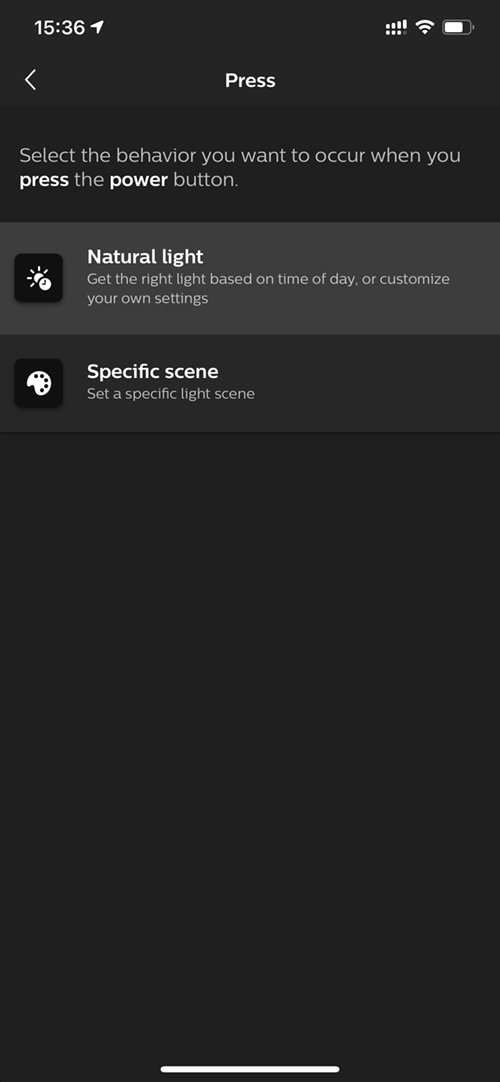
Time slots for the Hue Dimmer have been increased from two to five, all of which can have their timeslots customised. The Time-based mode is also a new addition.
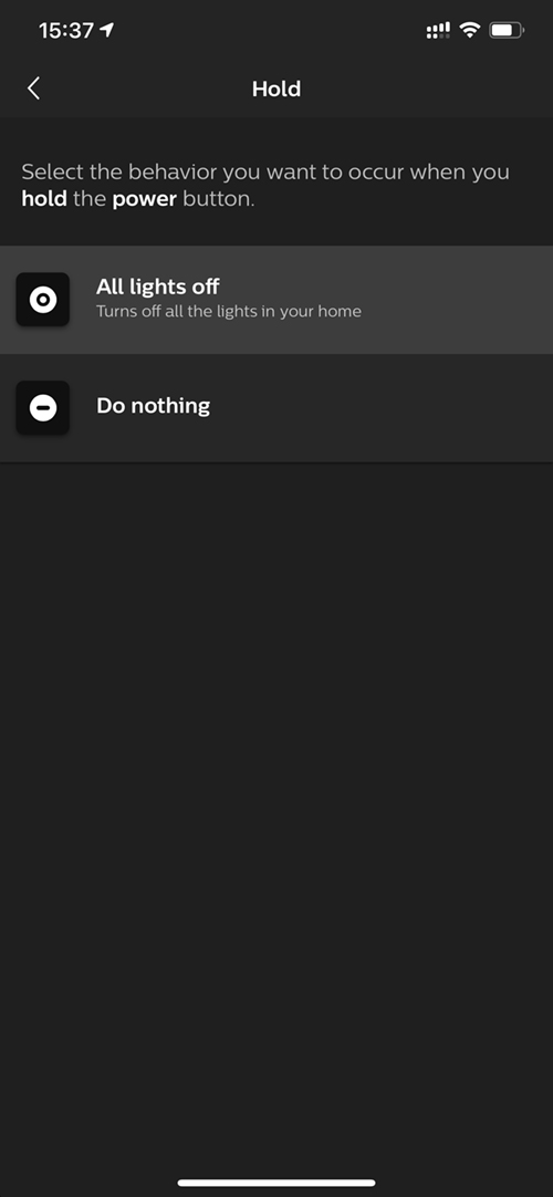
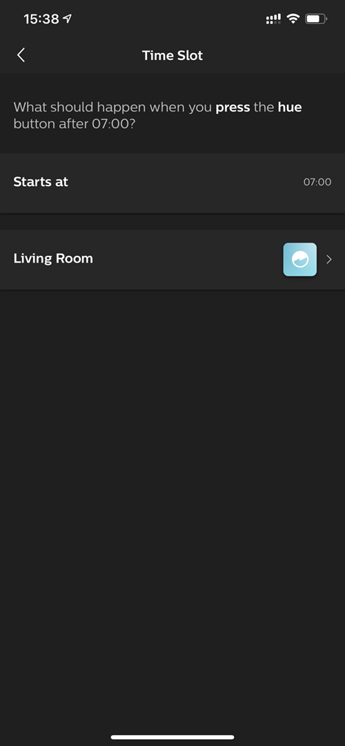
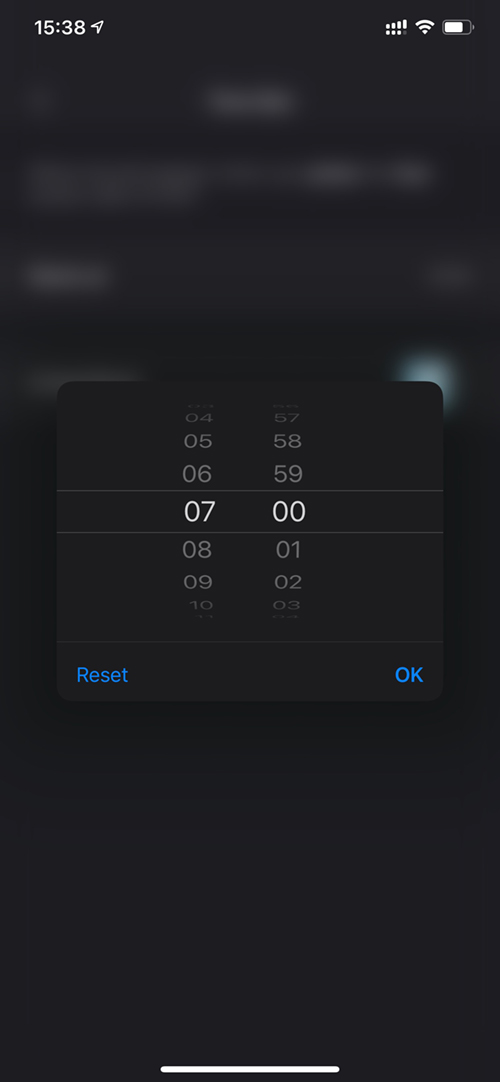
The top button has two separate actions now – press and hold. Each action has two further options.
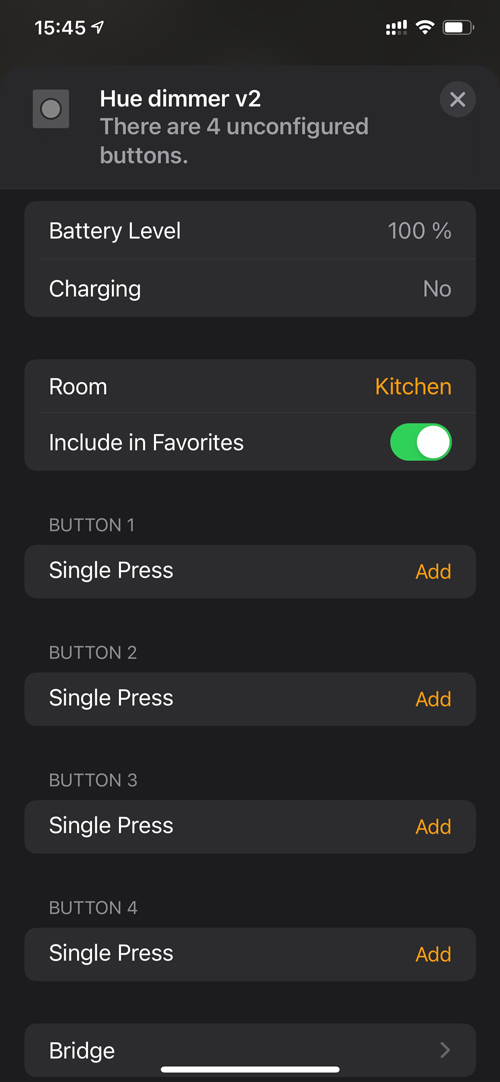
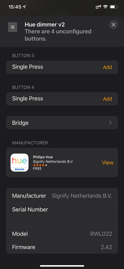
HomeKit remains much the same in this respect, and regarding the rumours that the new dimmer would only expose three buttons, and not four, we’re glad to report there are still four buttons exposed to HomeKit, as before.


