When it comes to air purifiers as a category in HomeKit, it might actually come as a surprise to know that there are a few options available, with offerings from Brid, Vocolinc, Coway, Opro9, Molekule, and now Smartmi, with their brand new P1 Air Purifier. There is another air purifier on the horizon, from Meross (MAP100), although as it’s not out at the time of writing, I’ll say no more on that. That said, only the Vocolinc, Molekule, and now the Smartmi are widely available.
Smartmi may be a newcomer to HomeKit, but the company are already well known in the Xiaomi world of fans, humidifiers, and air purifiers, so they’re not exactly green behind the ears when it comes to the smart home. With that in mind, we’ll take a look at the P1 and see whether it’s something you should get, assuming you live in an area with even moderately poor air quality.
PACKAGING/UNBOXING
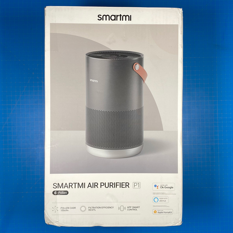
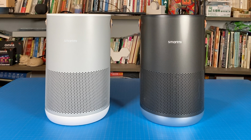
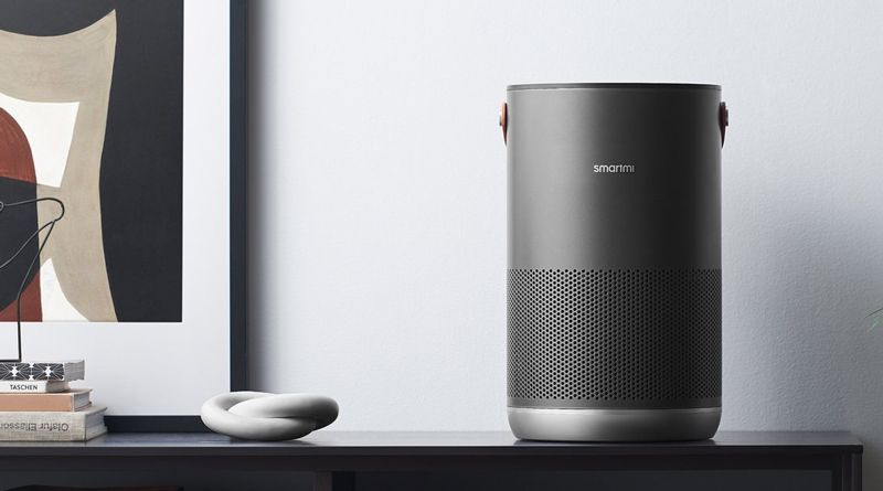
The Smartmi P1 comes in two colourways – silver and dark grey, although aside from the finish, there’s no difference between the products. The package reflects the specific finish you chose, and in the case of the image above, it’s the dark grey one, although I was also sent the silver model. Unlike most of the reviews, I won’t be dwelling on the packaging, as it did come rather bashed about, although I can say, the box survived the journey from China – North America – Taiwan without too much trouble, with the products themselves receiving no damage at all, so full marks for protection!
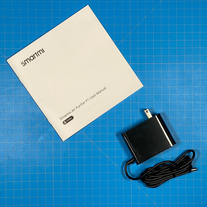
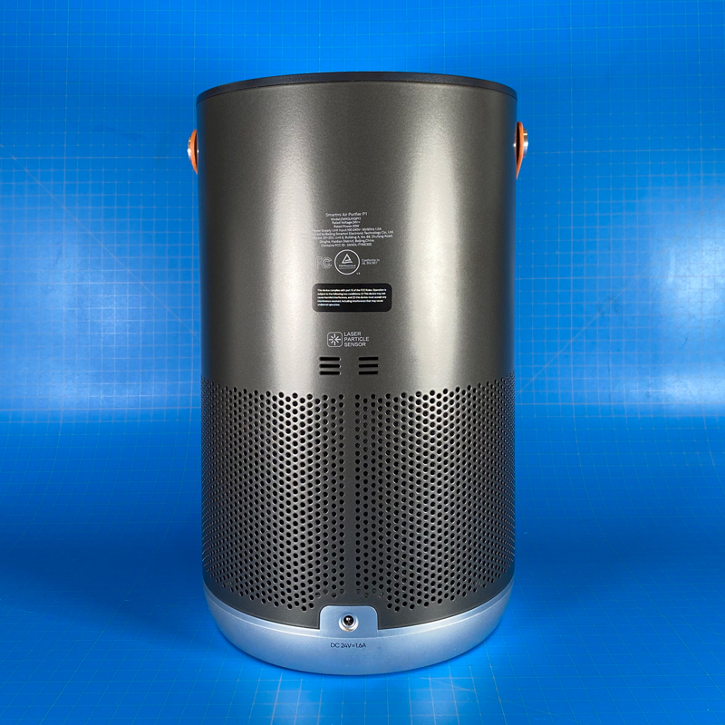
The package doesn’t contain a lot, just a manual in English, the power supply, which in my case is the North American, Type A, non-polarised plug, and the P1 itself. The front of the P1 sports the company logo, with the rear having the power connector, and vents for the particle laser sensor. You’ll find one instance of the HomeKit code on the base of the rear of the P1. The second instance is actually inside the shell of the P1, which you can only access when removing the filter.
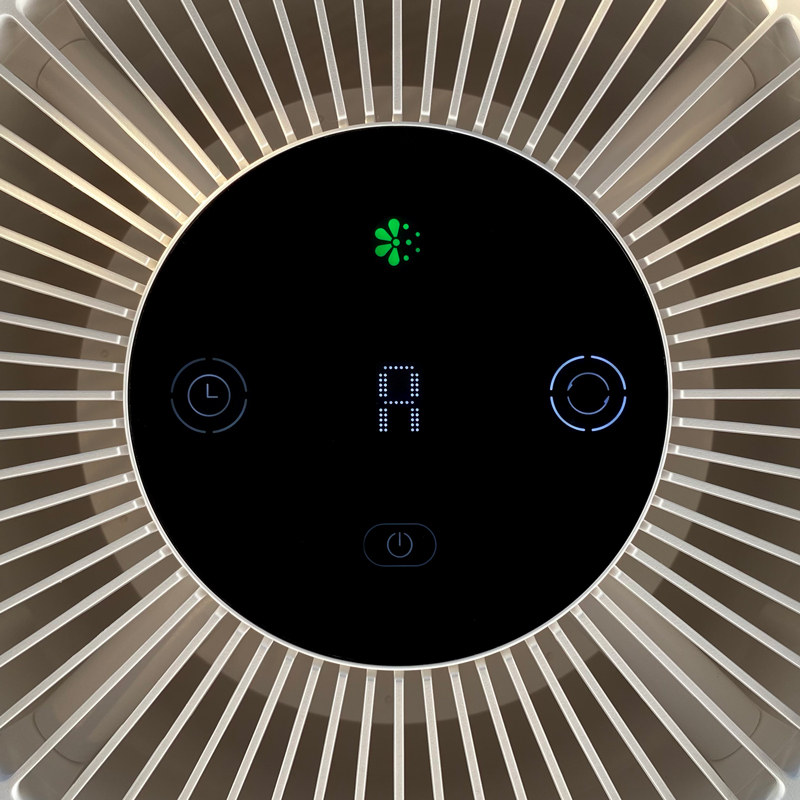
The top of the device has, unsurprisingly, the outlet fan where clean, filtered air is pushed out to the room. In the centre of the fan grill is the display panel for the P1, which also allows for control, due to the touch controls available.
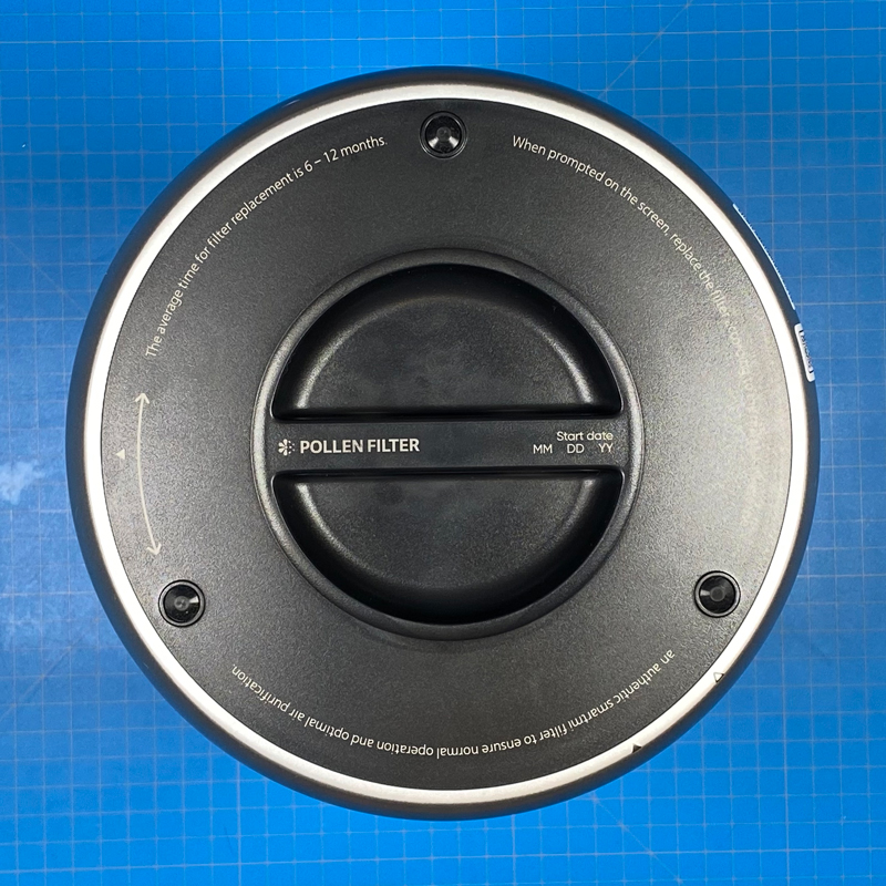
The base of the P1 is almost entirely made up of the actual filter itself, which sits inside the body of the device. The base reveals a turn handle that’s part of the filter, and so with a new filter comes a new handle essentially. There are two types of filter, which I’ll go into later.
Specifications (according to the manual):
- Dimensions – 220mm (W, D) x 360.5mm (H) / 8.66in (W, D) x 14.19in (H)
- Net weight – 3kg / 6.6lb
- Recommended surface area – 17.5 – 30 sq m. / 188 – 323 sq ft
- Connectitivity – WiFi 2.4GHz 802.11 b/g/n
- Rated voltage – 24V
- Rated power – 30W
- power supply unit input – 100-240V~50/60Hz 1.0A
THE CONTROL PANEL/DISPLAY
When the device is powered, but not in use, the only button displayed is the power button. Once pressed (tapped really, as it’s touch-sensitive), other details will light up, including a timer button, mode button, as well as an icon dedicated solely to how much pollen it detects (categorised as PM10).
In the centre is a WiFi icon. which when connected to your network, should be solidly lit. If it starts to flash, it means there’s an issue with the connection. next to that is text stating PM2.5, which is represented by the numbers below. In the case of the image above, you can see the PM2.5 levels are very low at 003. These numbers only represent PM2.5, not the overall Air Quality Index (AQI), which consists of measurements that are beyond the scope of this device.
The display usually shows the PM2.5 levels, but when changing other settings, the display will temporarily change to display information relevant to any changes made. So for example in the case of the image above, the countdown timer is set to four hours. Even though the display will revert to the PM2.5 levels, the ring around the Timer icon shows that it is set to count down, with the first quarter of the ring indicating a 1hr countdown, the first two-quarters lit will indicate a 2hr countdown. three out of the four quarters lit shows a 4hr countdown, and all four quarters of the ring lit up indicates the full 8hr countdown.
The P1 has four modes for cleaning the air – Sleep, Normal, Custom, and Auto (as displayed with the ‘A’ in the image above).
- Sleep mode is essentially the lowest mode, and therefore the quietest
- Normal mode is a sort of midway point, where it’s more powerful than sleep mode, but not too loud either
- Custom mode is one step above Normal mode, although, within the Smartmi app, you can adjust the speed of the fan to be more or less powerful
- Auto mode bases the power of the fan based on the sensor readings – be that pollen (pm10) or pm2.5
to switch between these modes via the controls, you press the left-hand button. As with the timer button, the four quarters that make up the outer ring for the button will light up consecutively as you progress through each mode.
The green icon at the top is to indicate pollen levels in the air, so if you suffer from this particular allergy, this may be a good indicator for you, although you would need the correct filter. The icon is Green under ideal (Very Good) conditions, with the icon changing to Yellow, Orange, or Red, if the pollen count is Good, Moderate, or Unhealthy, respectively. That said, the manual states that this icon should change colour based on levels of PM2.5 – PM10, although in the limited tests with smoke, which should come under PM2.5, the icon did not change at all, whilst the PM2.5 numbers on the main part of the display, increased as expected, so it’s a bit confusing. The additional ‘unknown’ is whether this icon is still used, or even replaced when you switch to the other filter (both P1’s I received had the ‘pollen’ filter installed).
OTHER ASPECTS OF THE P1
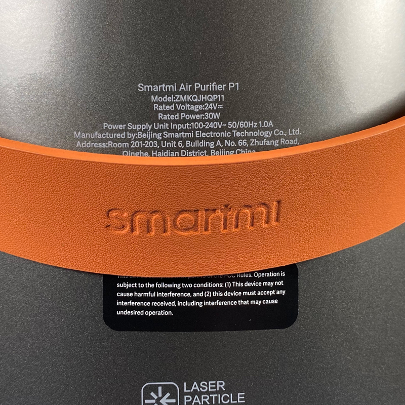
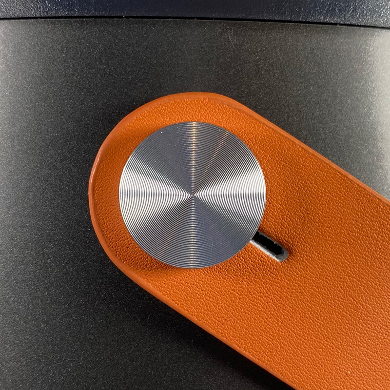
the P1 comes with a carry strap, which is made of leather (Genuine Leather, according to the website), with the Smartmi logo embossed into the centre of the strap. It’s held in place with two large aluminium studs on either side of the P1, which are equally impressively milled. The bottom line here is that the whole product looks really well designed, with the strap representing the epitome of this. Whilst out of necessity, there are parts that are what you might describe as functional in appearance, there’s enough good ‘design’ to make it stand out.
Going back to the carry strap, the dark grey P1 comes with the orange strap you see above, whilst the silver P1 comes with a beige strap. The P1 is easy enough to carry around for short distances (i.e. within the home), although I wouldn’t fancy carrying too far down the road for example, with the P1 coming in at just under 3kg/6.6lb.
HOME AND SMARTMI APPS
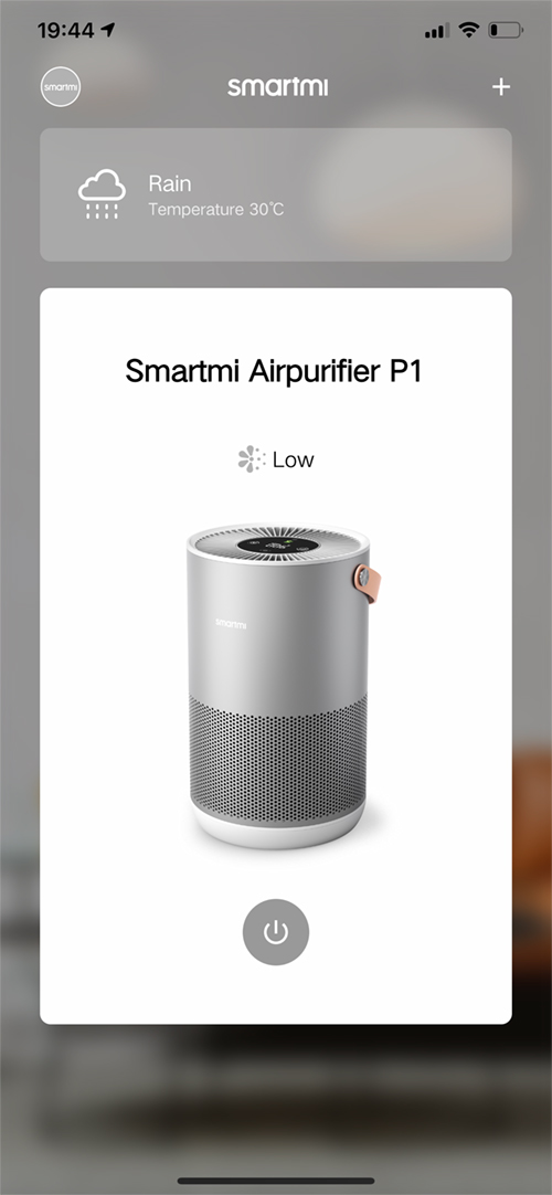
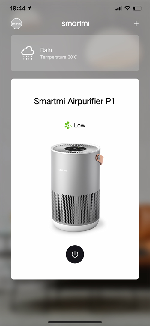
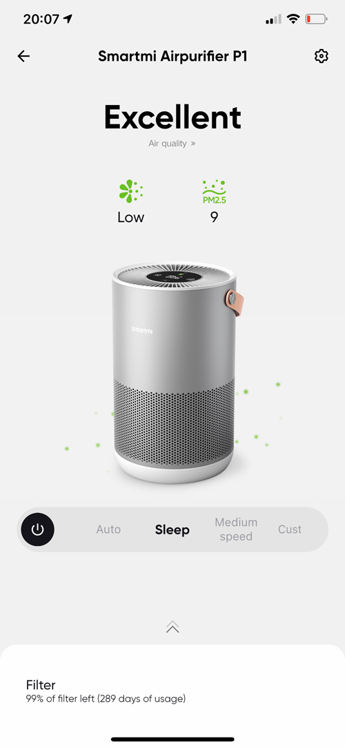
The Smartmi app is fairly basic and isn’t really designed as any form of third-party HomeKit app, although it does have its uses. It’s also very clearly laid out, and simple to use. You do have to create an account, so if this is something you’d prefer not to do, you can just add the P1 directly to the Home app and be done. The first page shows the device or devices connected to your Smartmi account. As you can see above, the page shows my silver P1. When it’s off, the power button and pollen icon are greyed out. Turning the P1 on results in the icons coming to life – sort of.
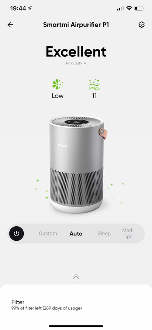
Once you tap on the image of your P1, you’re taken to the control screen. The top will state what the overall air quality is like in words (e.g. Excellent), along with the pollen icon in the relevant colour and the PM2.5 level next to that. Below the image of the P1, you have a scrolling bar that gives you access to all of the relevant modes, as well as another instance of a power button.
This is one area where there’s a slight discrepancy between what the manual and the app describe; Auto, Custom, and Sleep mode are all listed as you’d expect, although Normal mode in the manual is described as Medium speed in the app. It’s a small detail, but it should be noted.
Custom mode in the app brings up a cutaway image of the P1, along with a slider that allows you to adjust the speed of the fan yourself. It also shows measurements for the different positions on the slider to show what the suitable space (in terms of coverage in metres square) the particular speed you choose is right for. So the fastest speed you can set it to will cover an area between 18-30m sq.
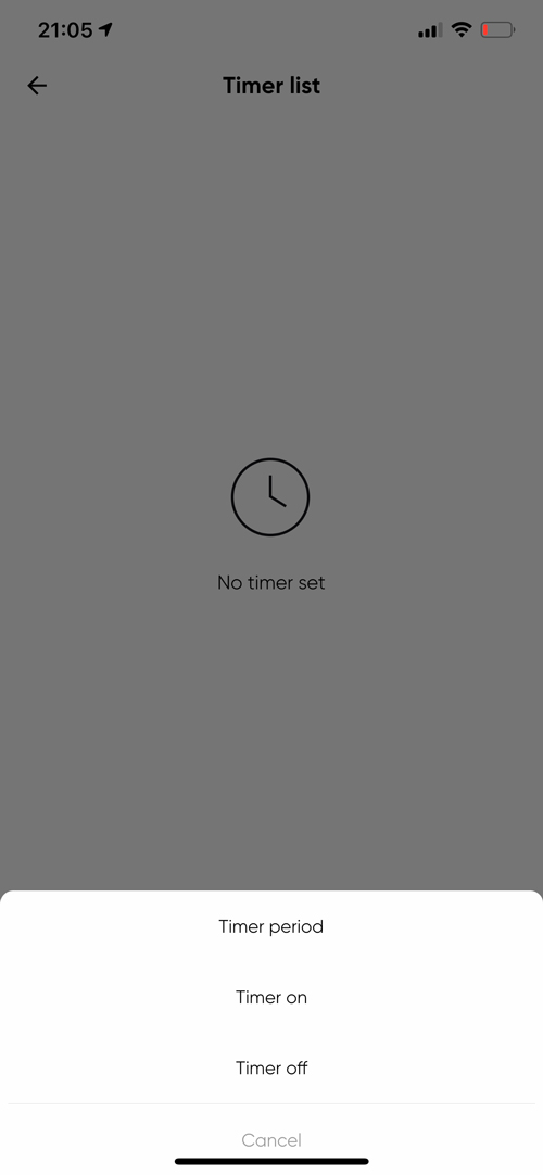
Finally, the app allows you to set various timers in addition to the preset countdown timers previously mentioned. In the Timers section, you can set a time period, or you can create on and off times for your timer based on 24 hours in a day. You can also set any of these timers to repeat every day, Monday to Friday, at the weekend, on custom days, or even set the timer to only run once.
The preset timers available from the control panel on the device are also available here. You can also turn the screen off, and you can also turn the beeper off, which sounds every time you press a button. This beep is rather loud, so you may well want to turn this activate (or in fact deactivate) this option.
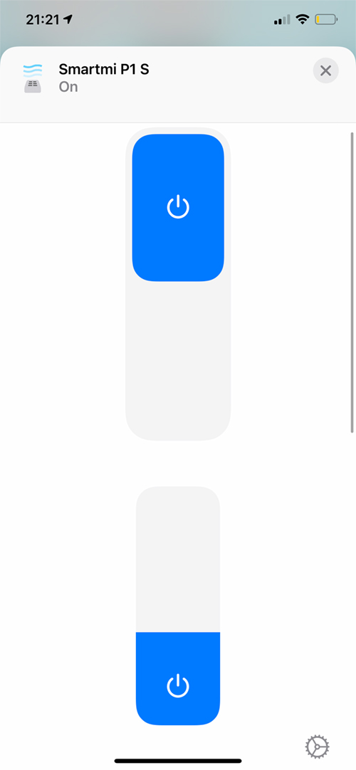
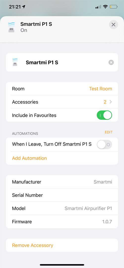
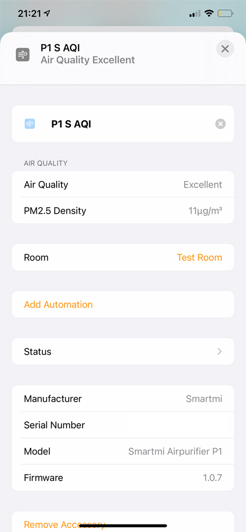
The Home app is in some ways a bit more involved. You only get a single tile, that when pressed, turns the P1 on or off. A long press takes you into two separate controls – an on/off toggle switch, and a fan speed slider. Beyond that, you get access to the familiar settings page, which amongst other things, lists two accessories…
This is where, I feel, things aren’t quite as good as they could be, although this may be down to the way in which the Home app deems how and where things appear. The two ‘accessories’ listed on the main settings screen are in fact just the P1, and the sensor, but as all sensors are now grouped at the top of the screen in the Home app, these two tiles can’t be separated in a way you used to be able to do. It is what it is, but to get to the Air Quality and PM2.5 density readings is a little more long-winded than I’d like, to be honest. Likewise, getting to the Manual and Auto controls is just as convoluted. They really should have these modes accessible on the main settings screen. To be fair, this is also the case with the Vocolinc PureFlow, so it would seem if the P1 didn’t expose the Air Quality sensor to HomeKit, you’d just have the one tile, with the remaining relevant options available on the first settings screen.
There is one other issue, in that while you can access the Sleep, Normal/Medium, and Custom modes easily in the Smartmi app or directly on the device itself, it’s not quite as straightforward in the Home app. For example, there’s no way to simply choose Sleep mode. You can adjust have the P1 in manual mode, and move the fan speed slider to a low position, but it can all be a bit of guesswork as to whether you’ve hit the right ‘spot’. Normal/Medium mode, are just variations on manual mode, so once again it’s down to you to adjust the slider rather than be able to quickly access the right speed/mode.
What has become apparent in comparing the P1 to the PureFlow, is that there’s no child lock to stop the P1 from accidentally being turned on. Aside from that, the PureFlow also has temperature and humidity sensors built-in, although I’ve got more than enough sensors covering these readings, so it doesn’t matter.
THE P1 IN USE / WRAPPING UP
I’ve had the P1 in the house for a while now, although I’ll admit it hasn’t been tested out as thoroughly as I’d like. Even though I’ve done a few basic tests to check that the sensor picks up smoke, for example, and shows this via the display, as well as ramp up the fan speed accordingly, I’ve not worked out how to do an effective pollen test. In a real-world situation with the PM2.5 sensor, normally I’d be able to see the results change quite often, due to the pollution issues related to Asia in general and Taiwan in particular. However, one side effect of the pandemic, which has also revisited Taiwan with a vengeance recently, has produced a side effect of much cleaner air in general, and so, what became a regular occurrence with regards to spikes in PM2.5, has been a mere blip of late. Still, having one of these purifiers in close proximity to our open plan kitchen area has made it pick up on some particulates that emanate from frying food. All in all, it seems to work exactly as expected.
Aesthetically, I love it, and if it were larger, one of these would easily take pride of place in the largest room in the house. As it stands, size matters, generally speaking, when it comes to Air Purifiers. and as this device is smaller in many aspects than the Vocolinc PureFlow, one of these is not really enough to cope. With that in mind, these are really more suited to bedrooms or other smaller rooms in the home, which is no bad thing, due to their size, and relative portability.
With the first Smartmi product for HomeKit, the company not only managed an extremely successful IndieGogo campaign but have been able to keep things polished with not only a tasteful looking product but a more than decent app (should you choose to use it). Together, these things create a decent impression to me at least, and, I find, lead to confidence that the company aren’t a fly-by-night operation, that will drop support for a product you spent hard-earned money on.
There’s really not a lot to complain about here if I’m honest, and all I can hope is that they can add HomeKit compatibility to their other products down the line, with special focus on their standing fans, which already unofficially work with HomeKit via HomeBridge.
For the price, this is a no-brainer, but if you think you don’t need an air purifier, let alone a smart one, either you’re very lucky or aren’t aware of the pervasive nature of PM2.5 pollution. Should it be the latter, please do yourself a favour and read this Wikipedia article…
Full disclosure: Smartmi (via Max Borges Agency) provided HomeKit News with the Smartmi Air Purifier P1 for the purpose of this review. No other compensation was made, requested or has not in any way influenced our opinion of this product.


